Points with purpose.
K-Points existed. Users just didn't know it was working for them. 97.9% redemption drop-off. 0 of 8 users could name their tier. A loyalty system buried three taps deep with no visible progress, no aspirational redemption path, and no reason to come back. This is how we redesigned it into a full loyalty ecosystem, and what the data looked like five months in.
Loyalty only works if users feel it working.
The K-Points system was live. Points were tracked. Tiers were assigned. But users weren't feeling any of it. There was no moment that said: you're being rewarded. No visible progress toward the next tier, no reason to come back. The data confirmed what felt obvious in research: if users don't see the system working for them, the system isn't working at all.
The business case was just as clear. Retaining an existing user costs a fraction of acquiring a new one, and users who engage with a loyalty program transact more, stay longer, and churn less. But a loyalty program buried three taps deep, with a redemption flow most users never completed, wasn't driving any of that. We weren't building retention. We were maintaining infrastructure nobody was using.
The opportunity wasn't to add features. It was to make the system feel real — visible progress, meaningful rewards, and a reason to keep going.
We dug into why. The answers were harder to ignore than expected.
Discovery ran across three streams: user interviews, Amplitude funnel data, and support ticket analysis. The goal was to understand not just what was broken: why users weren't engaging even when the feature was live. What came back wasn't a list of bugs. It was a picture of a loyalty system that had been designed from the inside out: built around what the backend could track, not around what users could understand or feel motivated by.
I narrowed this down to two core problems.
Invisibility.
The balance, the tiers, and the redemption paths were all technically present, but none were surfaced in a way that made users feel the system was working for them. Points felt abstract, tiers irrelevant, redemption needlessly complicated. Loyalty infrastructure with no loyalty experience built on top of it.
One-size-fits-all redemption.
Cashback was the only redemption path. It worked for impulse redeemers but not for users saving toward something meaningful. High-intent users (those who transact most and spend most per session) had no path that matched their appetite. And from a business perspective, cashback is a direct cost: every redemption is a margin hit. Merchant vouchers and partner redemptions flip that equation: each redemption becomes a revenue-share event, driving spend at partners instead of reducing margin. The product was underserving its best users and leaving commercial value on the table.
Four types of users. One system to serve them all.
Research surfaced four distinct mental models, each engaging with loyalty for a different reason, each breaking the existing system in a different way. The redesign had to work for all of them.
Uses the app for daily essentials. Transacts frequently but never explores beyond core payments.
Quick cashback. Points into money, no learning curve.
Four-screen redemption. Dropped off every time before confirming.
Cashback in 3 taps. Live conversion rate visible before committing.
High transaction volume. Status-conscious, wants recognition that the app sees her differently.
Visible tier, exclusive perks, recognition of her loyalty.
Tiers existed but were invisible. Platinum behavior, Bronze experience.
Tier badge, progress bar to Platinum, tier-exclusive rates surfaced upfront.
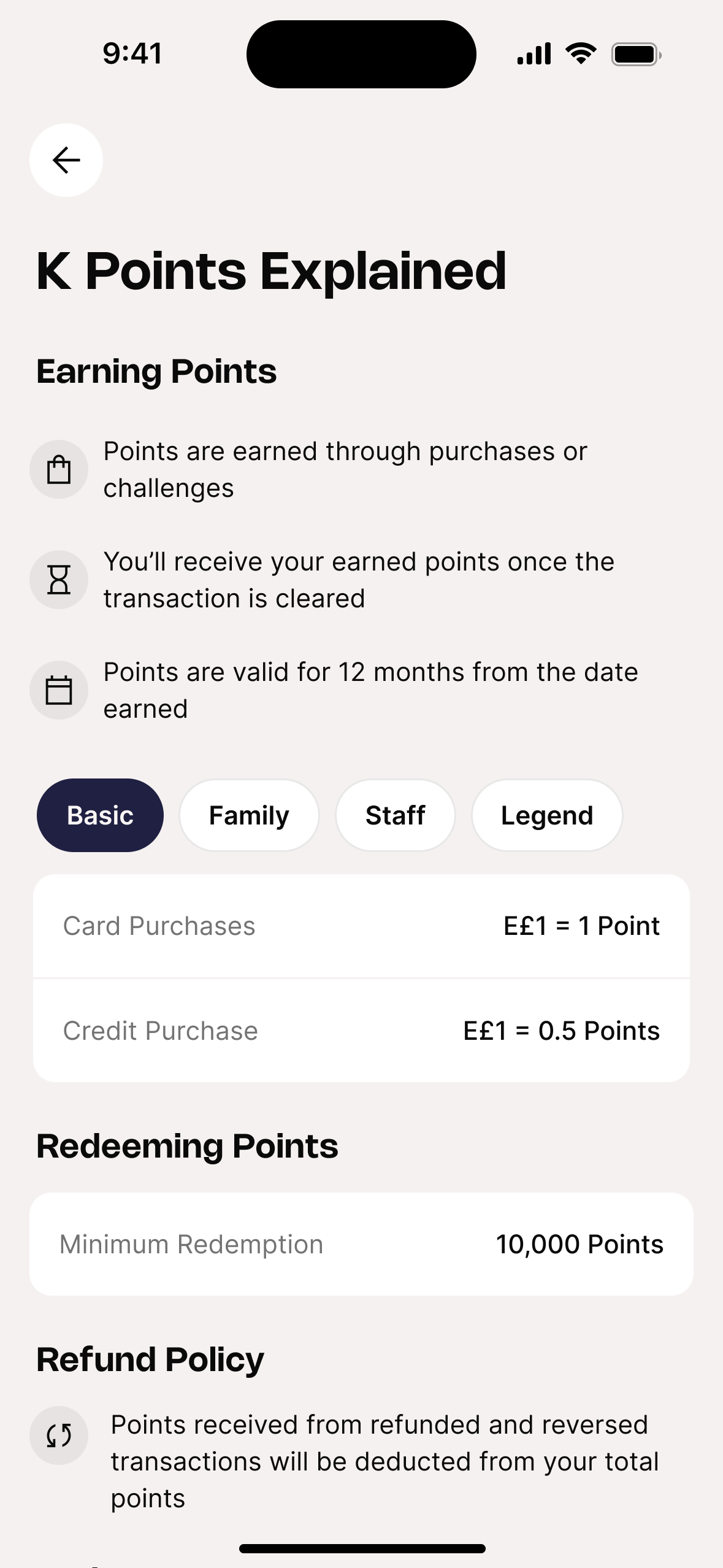
Primary use case is buy-now-pay-later. Earns at a different rate (E£1 = 0.5 Points). Motivated by financial tools, not rewards.
Understand exactly how his plan type affects his earn rate.
No education layer. Earn rates buried in T&Cs.
K Points Explained screen with plan-segmented earn rates behind a tab switcher.
Manages spending for a household of four. Thinks in family value, not individual reward.
Vouchers: higher value per point, worth saving toward.
No voucher system. Cashback only, too small for household-scale spending.
Voucher ecosystem, E£100–E£1,000 denominations, higher value per point at every tier.
How each persona actually uses the system.
Personas tell you who someone is. Scenarios tell you where the design breaks. Three critical journey moments: the exact places where the old K-Points lost people.
Notification taps to home screen. No loyalty entry point. He searches for 2 minutes, gives up.
Deep-links to loyalty hub. Balance is the hero. Progress bar shows the path. One tap to Redeem.
Moved to Gold silently. No feedback. She had no idea her redemption rate improved.
Gold badge, rate comparison, progress bar already counting toward Platinum with a deadline.
No voucher system. Cashback only, significantly less value for household-scale spending.
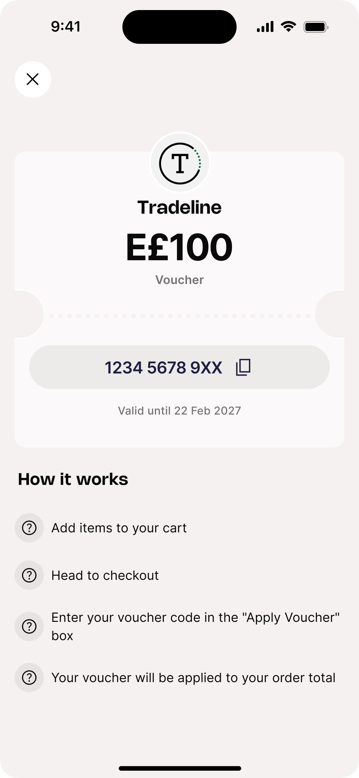
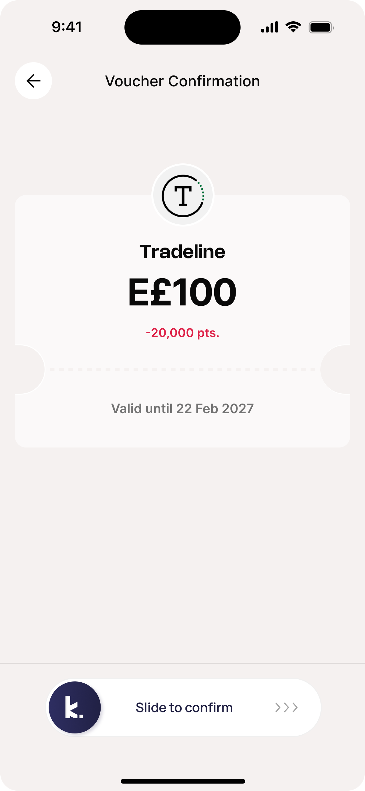
Four denominations per merchant. Slide-to-confirm. Code instant. 1,000+ redeemed in 5 months.
If earning feels effortless and redemption feels genuinely valuable, user behavior will change.
More spend. More frequency. More engagement. Give users a real reason to keep coming back, and the numbers will follow. It took six months to build, two major iterations to get right, and five months of live data to test whether the idea held up in reality.
Make the value impossible to miss.
Balance as hero. Tier as identity. Progress bar that tells the user exactly where they stand. If a user has to look for their points, the product has already failed.
Make redemption worth earning toward.
Cashback for immediacy. Vouchers for aspiration. Two paths, two mental models. The right option at the right moment turns a passive earner into an active participant.
Make progression feel active, not passive.
Linking challenges to tier advancement gave users a reason to open the app before a transaction, not just after. Specific goals outperform passive accumulation every time.
Here's what we built.
A loyalty ecosystem where every interaction with the product compounds into tangible value: four tiers, two redemption paths, and a partner voucher catalog built around real user behavior.
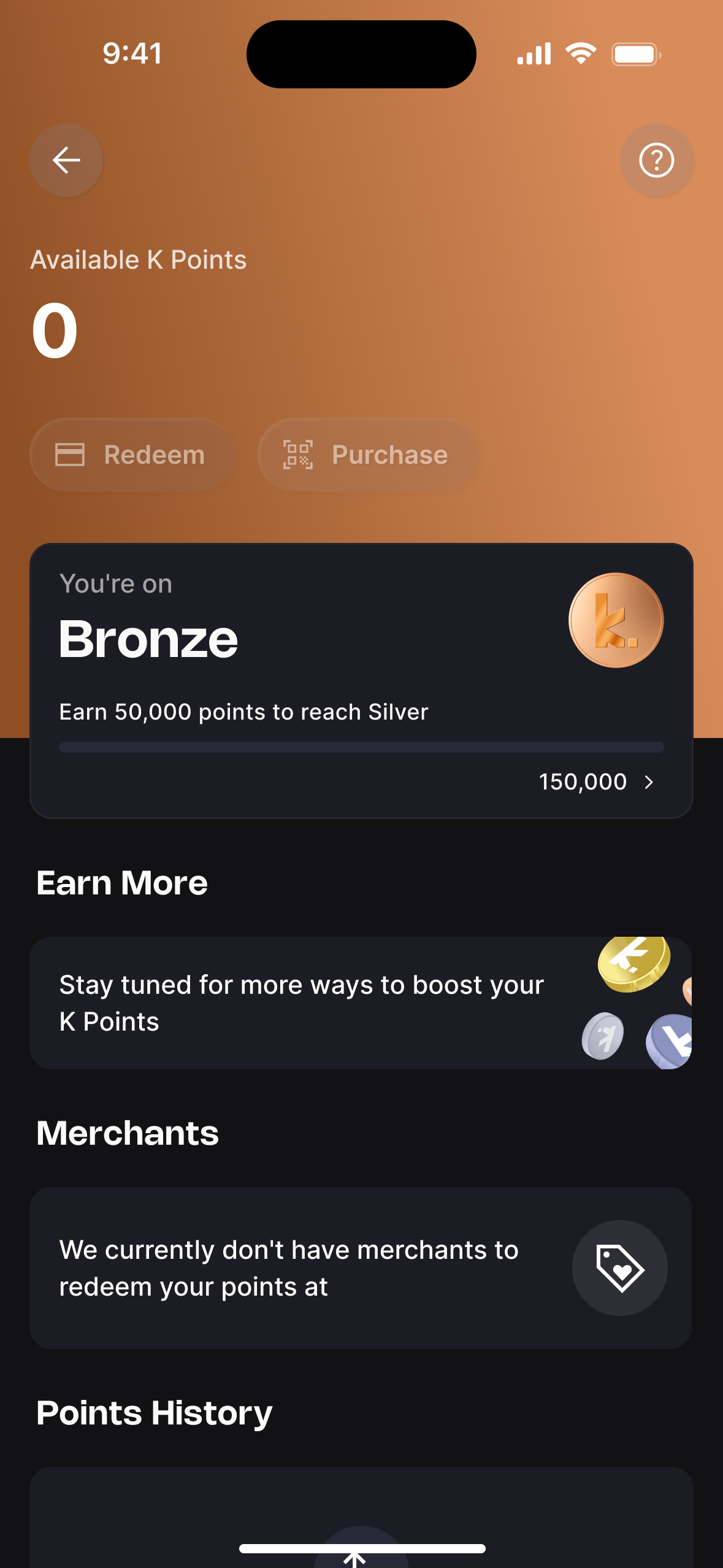
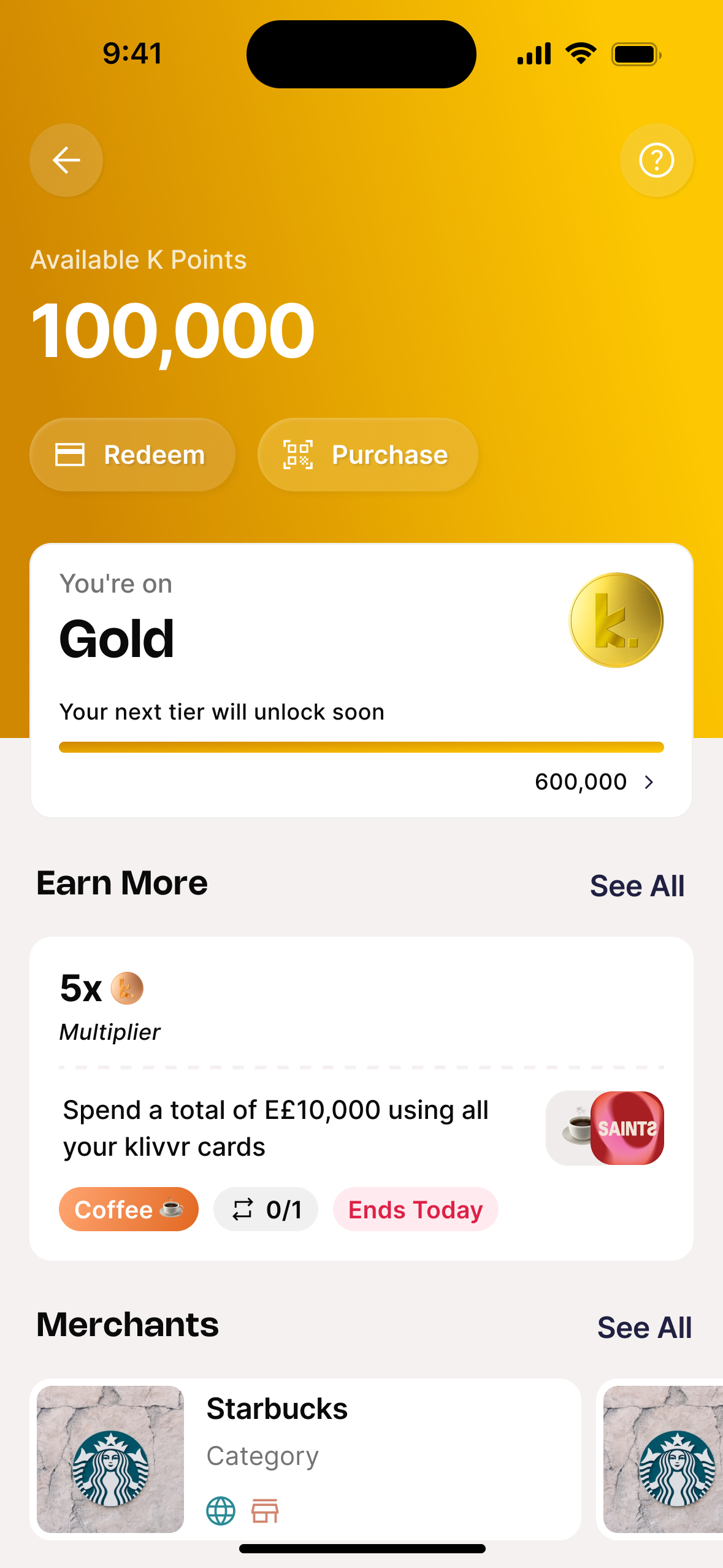
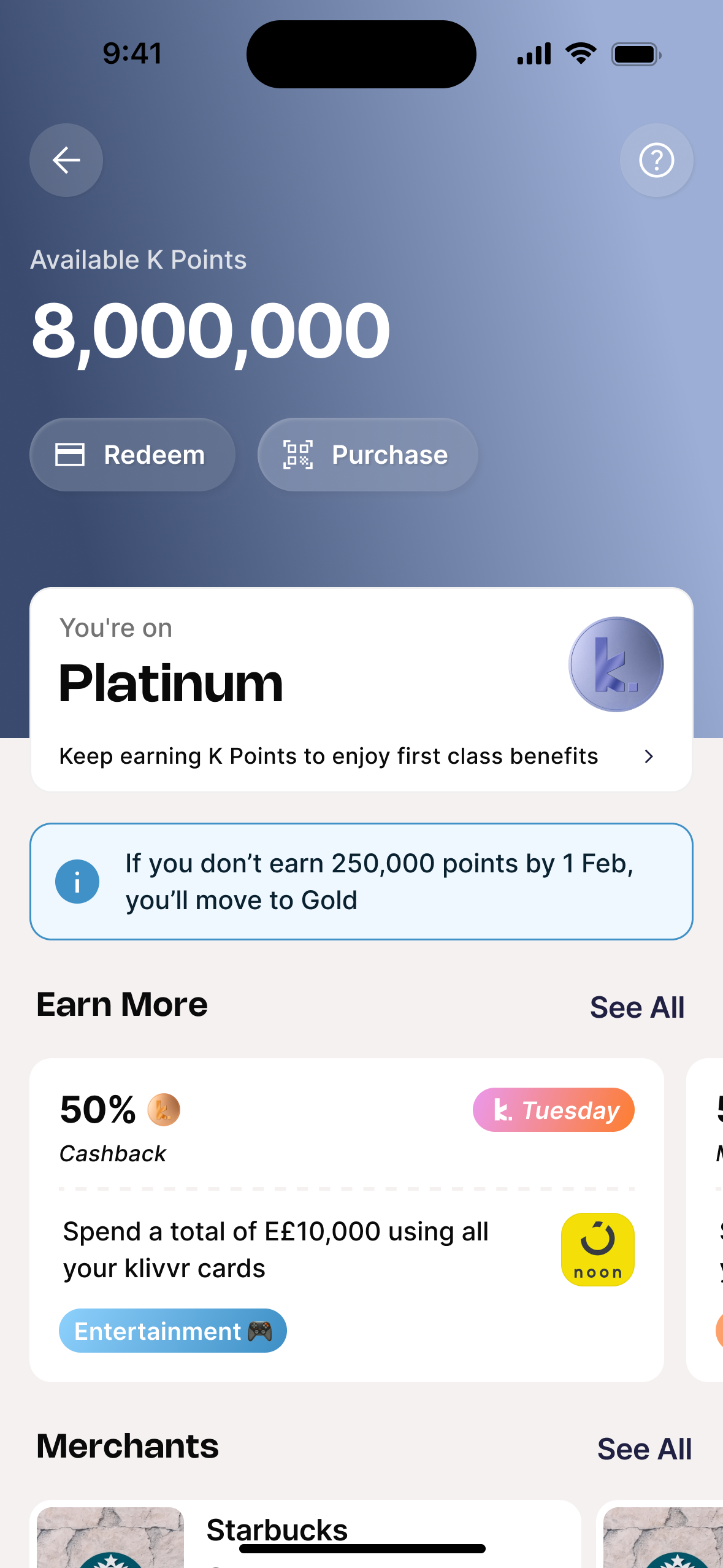
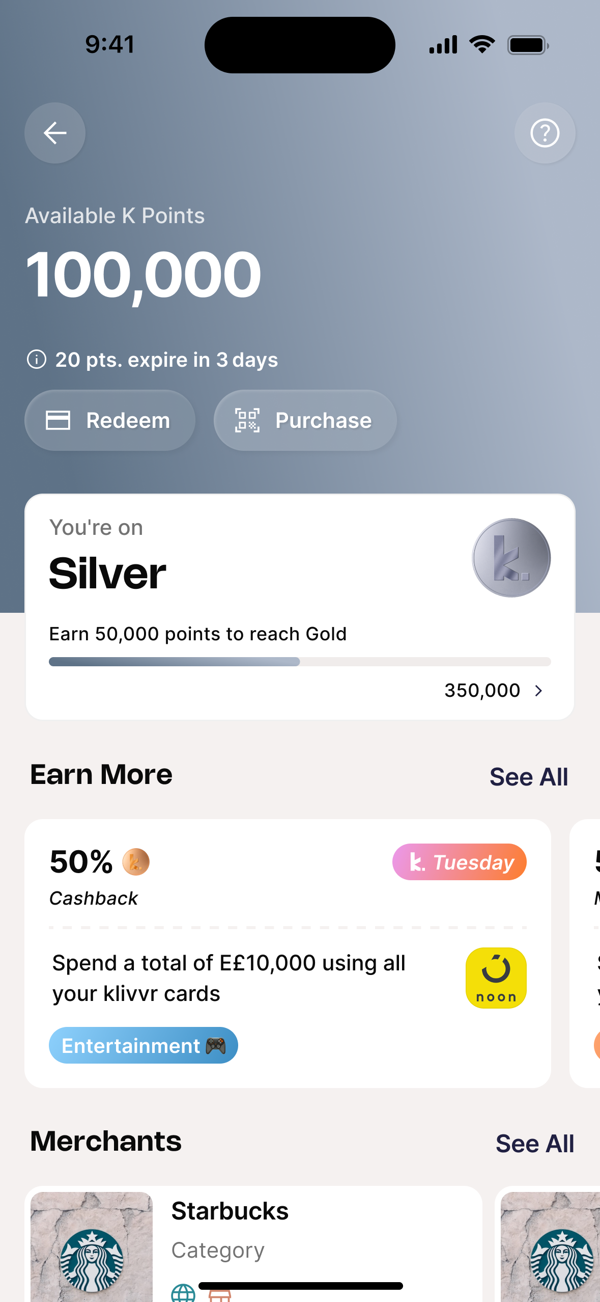
Four tiers. Each one visually distinct by design.
0 of 8 users in research could name their tier or describe what it unlocked. Tiers existed in the system. Not in anyone's mental model. The fix wasn't adding more information: it was making the tier feel real the moment you see it. Bronze, Silver, Gold, Platinum each get a distinct color identity so the upgrade moment is immediately recognizable without reading a word. Balance, badge, progress bar, and earn rate all change at once.
Your points, always in view.
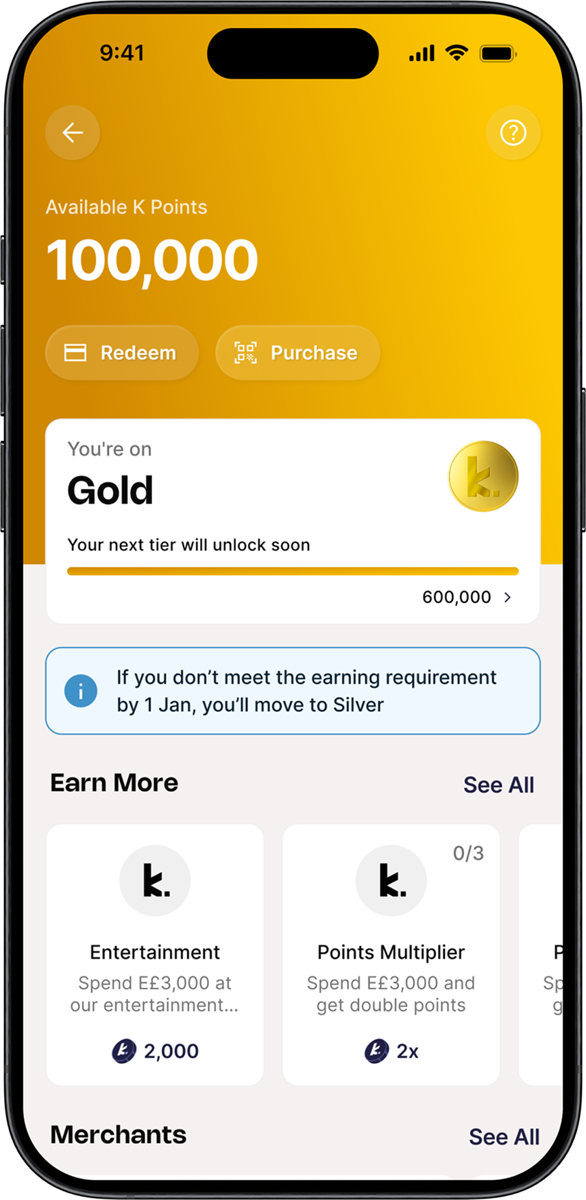
It took 3 taps minimum to reach the loyalty hub from home. No wonder users weren't engaging: they had to go looking for a feature that was supposed to feel like a benefit. The redesign made the balance the hero of the hub: the first thing you see, the clearest signal that the system is working for you. Below it: the tier card, an earn rate hint, and a scroll of time-bound challenges — specific actions to move the number up this week.
Redemption in three taps.
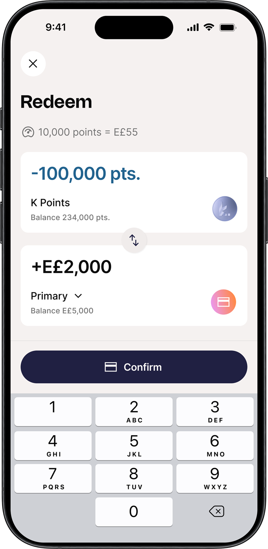
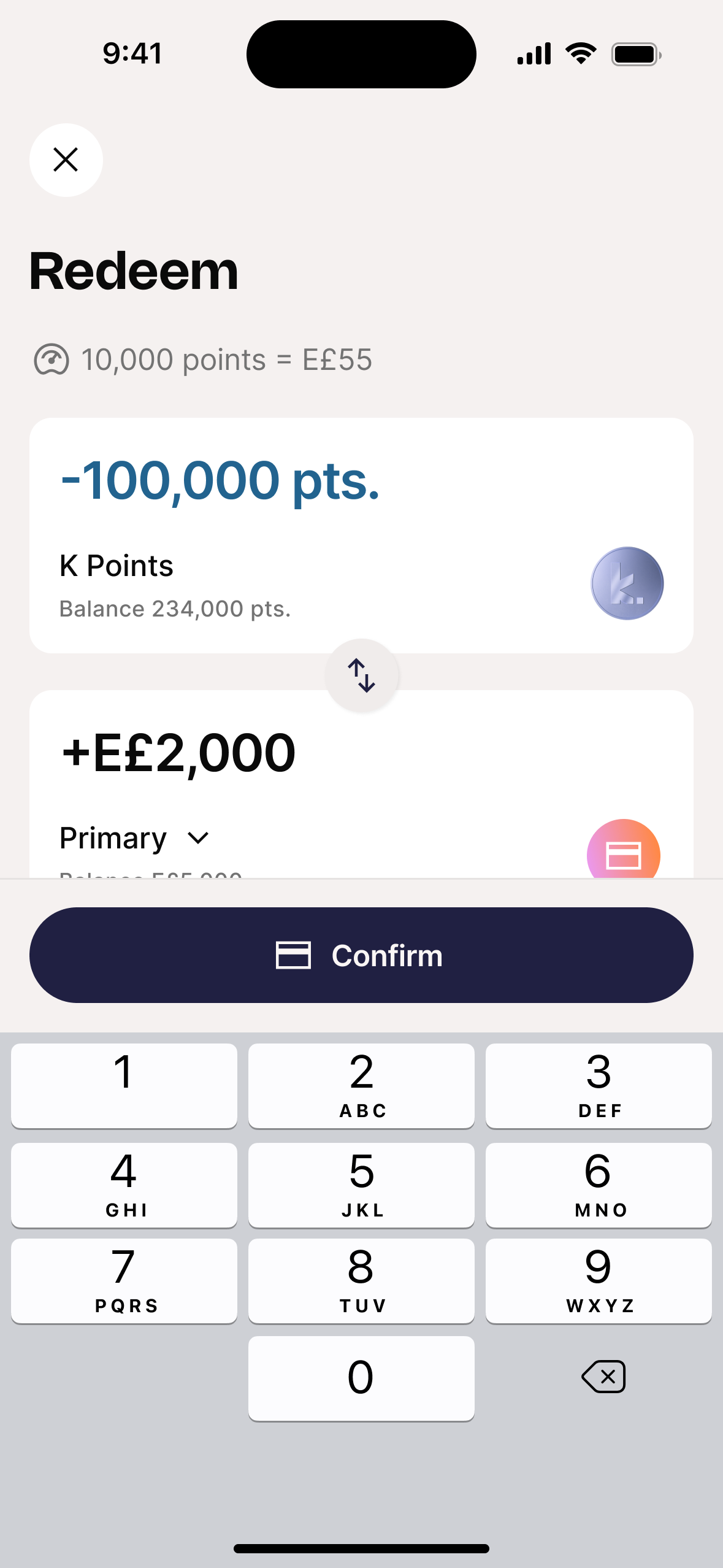
The old redemption flow had a 97.9% drop-off before completion. Four steps, no feedback, no sense of progress. Users who got to the end couldn't see what they'd actually get until the last screen. The redesign shows live conversion rates at every step. No surprises. Two paths: Cashback for immediacy, Partner Vouchers for users with something to save toward. Cashback now converts at 12.7%, the highest of any loyalty action in the app.
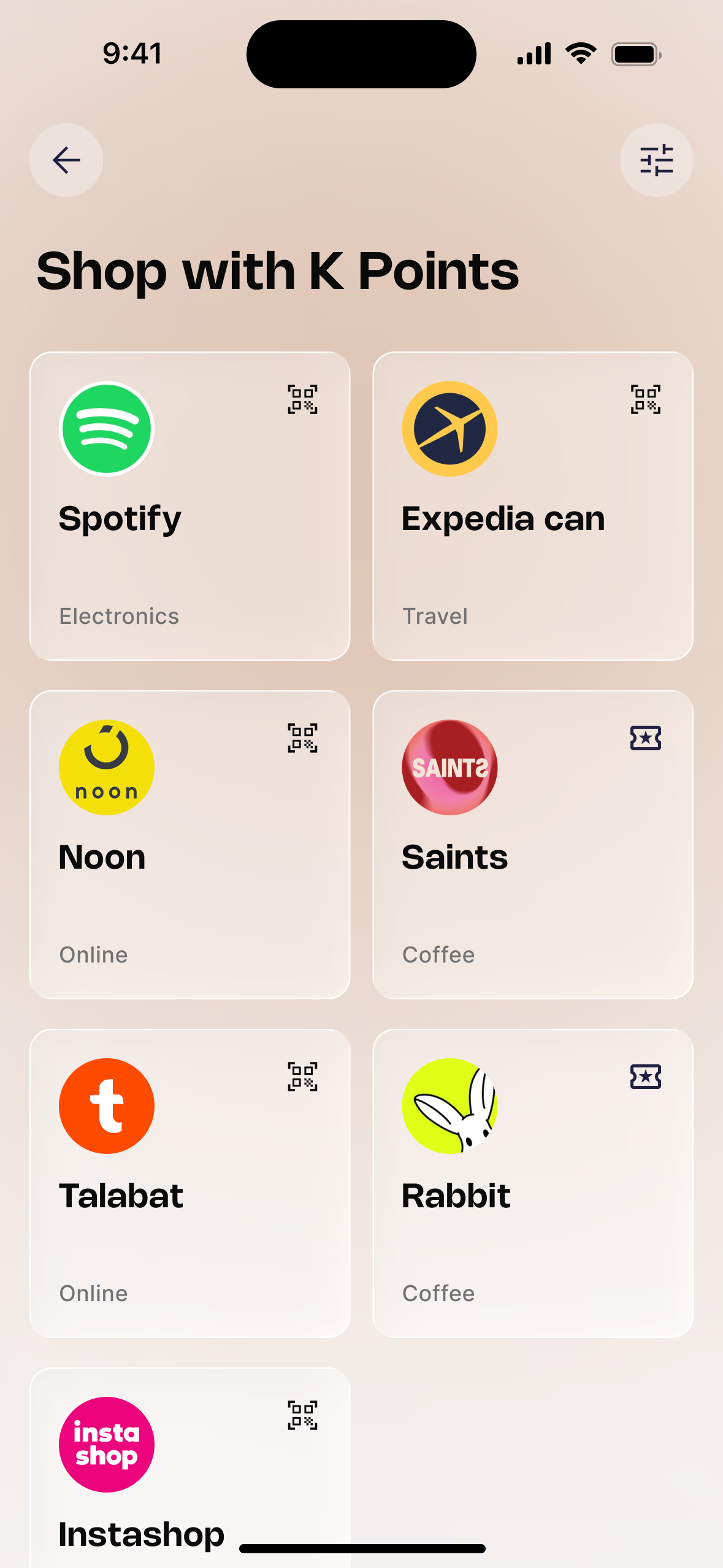
Partner rewards, surfaced.
Cashback is a direct cost: every redemption is a margin hit. Vouchers flip that equation: each redemption becomes a revenue-share event, driving spend at partners instead of reducing margin. The voucher system was designed as a first-class destination: four denominations per merchant, slide-to-confirm that matches the gravity of a non-refundable action, one-tap code copy with redemption instructions built in. 1,000+ vouchers redeemed in five months. The highest-value path became the fastest-growing one.
Three decisions that shaped the final product.
Each one came from a constraint, a data signal, or a live test result — not from a brief.
V1: Ship the foundation. Cashback only, no vouchers. Prove the core before adding complexity.
The first version launched with the core loyalty engine: visible balance, four-tier progression, and cashback-only redemption. The hypothesis was that getting the foundation right first would drive enough initial engagement before expanding the catalog.
Cashback drove 12.7% conversion, strong for a first release. But users were hitting the redemption screen, seeing one option, and leaving. Power users and family plan users needed a higher-value alternative that cashback couldn't deliver.
The insight: A single redemption path is a ceiling, not a foundation. The data justified the redesign.
V2: Partners couldn't integrate. So we built the whole voucher system ourselves — and it scaled better.
Merchants couldn't integrate with a QR-based redemption portal (too much technical lift, timelines didn't match). The original merchant flow was dead on arrival for most partners. We had to design around it, not through it.
A fully product-managed voucher lifecycle: bulk ingestion, inventory, redemption, and fulfillment all internal. Merchants needed zero integration. Within five months: 1,000+ vouchers redeemed, cashback redemptions dropped 16% as users migrated to higher-value paths.
The insight: Partner constraints aren't blockers — they're product inputs. What started as a workaround became the most scalable part of the ecosystem.
Post-launch: Tier progression was still passive. Challenges became the fix — and the strongest engagement signal we had.
After the redesign launched, Amplitude data showed tier progression was still mostly passive. Users earned through regular transactions but weren't actively trying to reach the next tier. The gap between Silver and Gold felt abstract, not achievable.
We linked Challenges & Rewards directly to K-Points earning. Completing a challenge didn't just give a reward, it accelerated progress toward the next tier. Specific, time-bound goals gave users a reason to open the app before spending, not just after.
The result: April — 24 campaigns, +57% participation. May — 35 campaigns, +42% participation. Challenge completion became the fastest path to tier advancement and the strongest engagement signal in the entire dataset.
Five months. The hypothesis held.
Five months of live data doesn't prove success, but it's consistent across every signal: spend up, transactions up, engagement up, and users migrating toward higher-value redemption paths. The behaviors the design was built to create are showing up in the data.
What I'd do differently.
I'd build the challenges layer before the tier system, not after. The data shows specific, time-bound goals drive engagement more powerfully than passive progression. If we'd led with challenges in the initial launch, the engagement curve would have been steeper from day one. In retrospect, challenges should have been V1; the tier system is what made them stick.
On partner constraints as design inputs.
The voucher pivot was the most important decision of the project, and it came from a constraint, not a brief. Merchants couldn't integrate technically. Instead of treating that as a blocker, we designed around it and built something more scalable than the original plan. The technical constraint ended up shaping the strongest part of the product.
Loyalty is a long game.
Five months provides confidence, not proof. We're seeing growth in spend, stronger engagement patterns, increasing challenge participation, and users exploring more valuable redemption journeys. The real test is whether the behaviors we're creating today translate into measurable retention twelve months from now.
What's next.
The foundation is in place. Users understand the system, tiers feel meaningful, and redemption has real pull. The next layer is behavioral: streak tracking that rewards consistency, spin mechanics that make earning feel like an event, and challenge integration that turns passive point accumulation into active participation. The data shows users are ready for more engagement. The design work is making sure more engagement doesn't mean more complexity.