Letting you in.
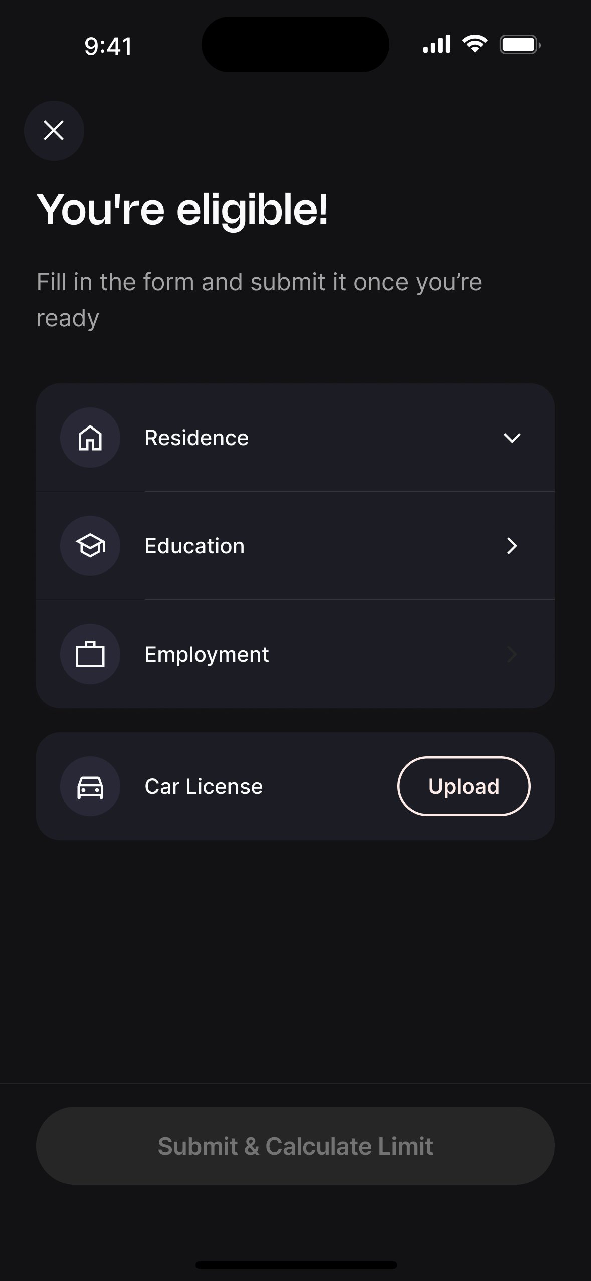
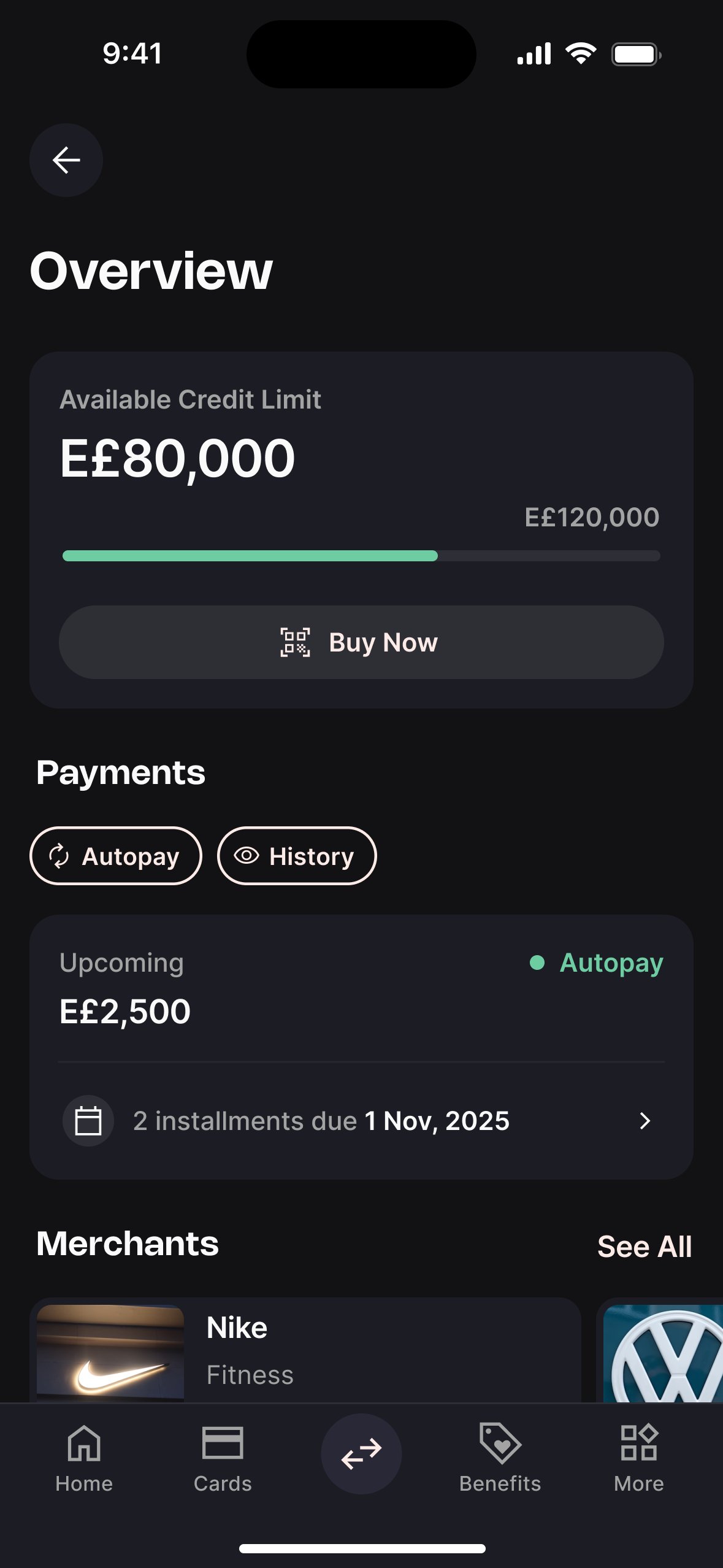
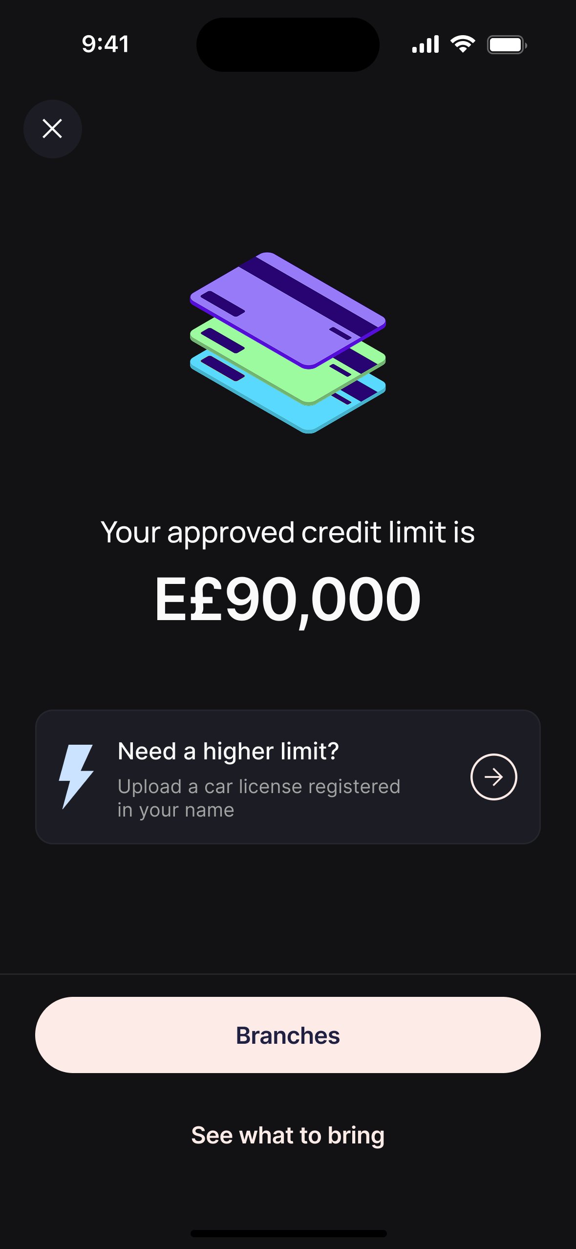
Consumer credit in Egypt comes with a trust deficit built over years of being failed by banks, especially for informal workers, freelancers, and first-timers. This was the product built to reach them. I designed it from zero: no inherited flows, no prior version, no design system for financial products to lean on. I owned the full product surface: how users apply for a credit limit (LOS) and how they live with it day to day (LMS). Sole designer across 12+ months. Now live, with an active user base.
Four mental models, one product.
Research surfaced four distinct relationships with credit, each one breaking the experience in a different place. The product had to work for all of them without collapsing into a lowest common denominator.
The employed professional
Salaried, 28–38, smartphone-native. Finds banks slow and opaque. Wants fast approval, a clear limit, and QR at point of sale. The iScore fear stopped them before they even started.
The self-employed
Freelancer or business owner, variable income. Has been rejected by banks before. Every employment form they've encountered assumed a salary slip. They were invisible to the system. Conditional field logic made them visible.
The active borrower
Already approved, 2–4 active loans across different merchants. The LMS is their daily product. Without a consolidated view, each loan lived in isolation — they had to open every single one to understand what they owed.
The cautious first-timer
22–32, first credit product ever. Every screen is new territory. Trust has to be earned step by step. Any friction, any ambiguity, any unexplained ask is a reason to leave. Transparency isn't a nice-to-have; it's the product.
We didn't open Figma first.
Consumer credit is the highest-stakes interaction most of these users had ever had with a financial product. A bad experience doesn't just lose a customer — it confirms a fear they already had about fintech. That's what we were designing against.
Market & competitive research
Audited 6 BNPL and consumer credit products across Egypt and MENA. Mapped entry flows, decision feedback, and LMS patterns.
User interviews & stakeholder sessions
8 user interviews across employment types. 3 stakeholder sessions with PM, risk, and ops to align on constraints and success metrics.
Usability testing & live data
Moderated sessions before launch. Post-launch Amplitude funnel analysis drove two major iterations to the LOS flow and the LMS overview.
The market had a trust problem.
Every product we audited was technically functional. None of them treated users like people. Rejection was abrupt, eligibility was hidden, and the experience ended at the decision screen. Win or lose, you were on your own.
Eligibility criteria hidden until after full form completion, causing mass abandonment at the decision screen
Rejection messages were blunt and unexplained: "not eligible" with no context or alternative path
LMS experiences were purely transactional: no hierarchy, no proactive guidance, no payment nudges
Most products didn't account for informal employment; forms assumed salaried workers only
Move eligibility check early: let users know they qualify before asking for everything
Design the rejection and semi-rejection states as genuine product moments, not dead ends
Build an LMS with clear visual hierarchy: what's due, what's upcoming, what's available
Use conditional logic to support freelancers, self-employed, and housewives, not just the salaried majority
Eight interviews, one consistent fear.
We ran 8 moderated interviews across four user segments: salaried employees, self-employed, first-time credit applicants, and existing product users. Sessions lasted 45–60 minutes and covered attitudes toward credit, previous application experiences, and reactions to early lo-fi prototypes.
"I didn't know what would happen to my iScore."
7 of 8 users mentioned iScore unprompted. Most believed applying would automatically damage it. This was the single biggest barrier to starting the application. It had nothing to do with the UI.
Design response: Added iScore reassurance messaging at the application entry point.
"The form felt like it would never end."
When shown a linear, step-by-step prototype with no progress indication, 5 of 8 users abandoned during employment information. The form felt arbitrary; they couldn't see how close they were.
Design response: Added a segmented progress bar across all form steps.
"I'm a freelancer — none of the options fit me."
Freelancers and self-employed users felt excluded by employment forms designed for salaried workers. Income documentation, length of service, and company type fields all assumed formal employment.
Design response: Conditional field logic: unemployed/freelancer users see a different, shorter field set.
"I don't know when to pay or how much."
When shown early LMS wireframes, users with multiple active loans couldn't quickly identify what was due. They had to navigate into each loan individually to build a mental picture of their total obligations.
Design response: Consolidated due payments banner surfacing total owed across all loans.
Six products. Six gaps.
Scored across seven dimensions: the ones a user actually cares about when applying for credit on their phone. Ours is highlighted. The gaps informed the brief.
| Product | Early eligibility check | Instant decision | Freelancer support | Semi-rejection path | LMS overview | Autopay | Early settlement |
|---|---|---|---|---|---|---|---|
Competitor A Egypt · BNPL |
✗ | ✗ | ✗ | ✗ | Partial | ✗ | ✗ |
Competitor B Egypt · BNPL |
✗ | Partial | ✗ | ✗ | ✗ | ✗ | ✗ |
Competitor C UAE/KSA · BNPL |
✓ | ✓ | Partial | ✗ | ✓ | ✓ | ✗ |
Competitor D KSA/MENA · BNPL |
✓ | ✓ | ✗ | ✗ | ✓ | ✓ | Partial |
Competitor E Egypt · Consumer credit |
✗ | Partial | ✗ | ✗ | Partial | Partial | ✓ |
Competitor F Egypt · Consumer finance |
✗ | ✗ | ✗ | ✗ | ✗ | ✗ | Partial |
Our Product Egypt · BNPL + Credit |
✓ | ✓ | ✓ | ✓ | ✓ | ✓ | ✓ |
Our product is the only one in the Egyptian market with all eight features. The two nearest competitors are not Egypt-native and don't fully serve the informal employment segment, which represents a significant share of Egypt's working population.
From research to design questions.
Research surfaced five recurring failure patterns. Each one became a design question: not "what went wrong" but "how might we fix it." These five questions drove every subsequent design decision.
How might we build trust before asking for data?
7 of 8 users mentioned iScore unprompted. The barrier wasn't the UI — it was fear of a consequence they couldn't see or verify. No design pattern fixes that. Only reassurance, upfront, does.
How might we make data collection feel purposeful?
5 of 8 users abandoned our prototype during the employment step. No progress indicator meant no sense of an end. The form felt arbitrary, not effortful.
How might we turn rejection into dignity?
In V1, 39% of users who reached the decision screen dropped off. A hard rejection after 8 screens of personal data didn't just frustrate — it eroded trust. The grey zone needed a path, not a wall.
How might we surface the right debt at the right moment?
4 of 8 users had more than one active loan. They couldn't answer a basic question — "what do I owe this month?" — without opening three screens. Each loan lived in a silo. The mental load of reconciling them was ours to solve, not theirs to carry.
How might we encourage autopay without eroding control?
Autopay adoption started at 3%. Not because users didn't want it — but because "set it and forget it" felt like surrendering oversight. The fix wasn't a better settings screen. It was making the benefit visible at the moment users felt the friction of repayment.
The first version taught us everything.
V1 shipped with a linear 10-step application and a basic LMS overview. Post-launch Amplitude data and a second round of usability testing revealed two critical failure patterns. V2 addressed both.
Eligibility at the end
Users completed the full 10-step form before finding out if they qualified. Amplitude showed a 39% drop at the decision screen — the highest single drop-off point in the entire funnel.
Eligibility at step 2
Moved the check immediately after NID. Users who pass see "You're eligible!" before a single form field. Users who don't pass exit cleanly at step 2 — without wasting time or feeling deceived.
Flat loan list
The overview was a flat list of loans with no payment summary. Users with 3+ active loans couldn't quickly understand their total obligations. Autopay was buried in settings: 3% adoption.
Structured overview + inline autopay
Three-section overview: available credit, consolidated due payments, then loans list. Autopay surfaced as a quick insight card labelled "Avoid late payments" directly under the due banner.
What testing actually changed.
Two rounds: 5 moderated sessions on prototype before launch, 4 unmoderated sessions after V1 shipped. Every finding below changed something in production.
Credit balance mistaken for a bank balance.
Users saw a number and assumed they could withdraw it. Three users in pre-launch sessions tried to transfer the balance out. If that misread ships, the first action most users take ends in failure and confusion.
Installment counter read as remaining, not paid.
A "3/6" display read as "3 left" by most users, not "3 done." They overestimated their remaining obligations, which created anxiety right where we needed confidence. A label fix, not a feature.
Freelancers nearly dropped off the employment form.
4 of 5 freelancer users paused on the employment type screen. The form listed "Employed," "Business Owner," "Unemployed" — nothing that felt right. Two said "maybe this isn't for me" out loud before selecting a workaround. The product was designed against that exact assumption.
The Application Form.
How a user goes from discovering the product on the home screen to receiving an approved credit limit, in minutes, entirely on mobile.
From home screen to approved limit.
Eight steps from tap to approved limit — each one a potential exit point. The credit model needs a lot of data. Our job was to ask for it without making users feel interrogated. Early eligibility filtering meant users who weren't going to qualify found out at step 3, not step 8. Every field sequence was validated against drop-off data to earn the next question.
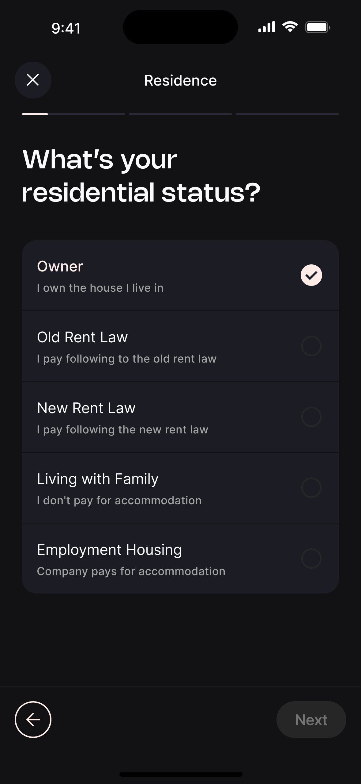
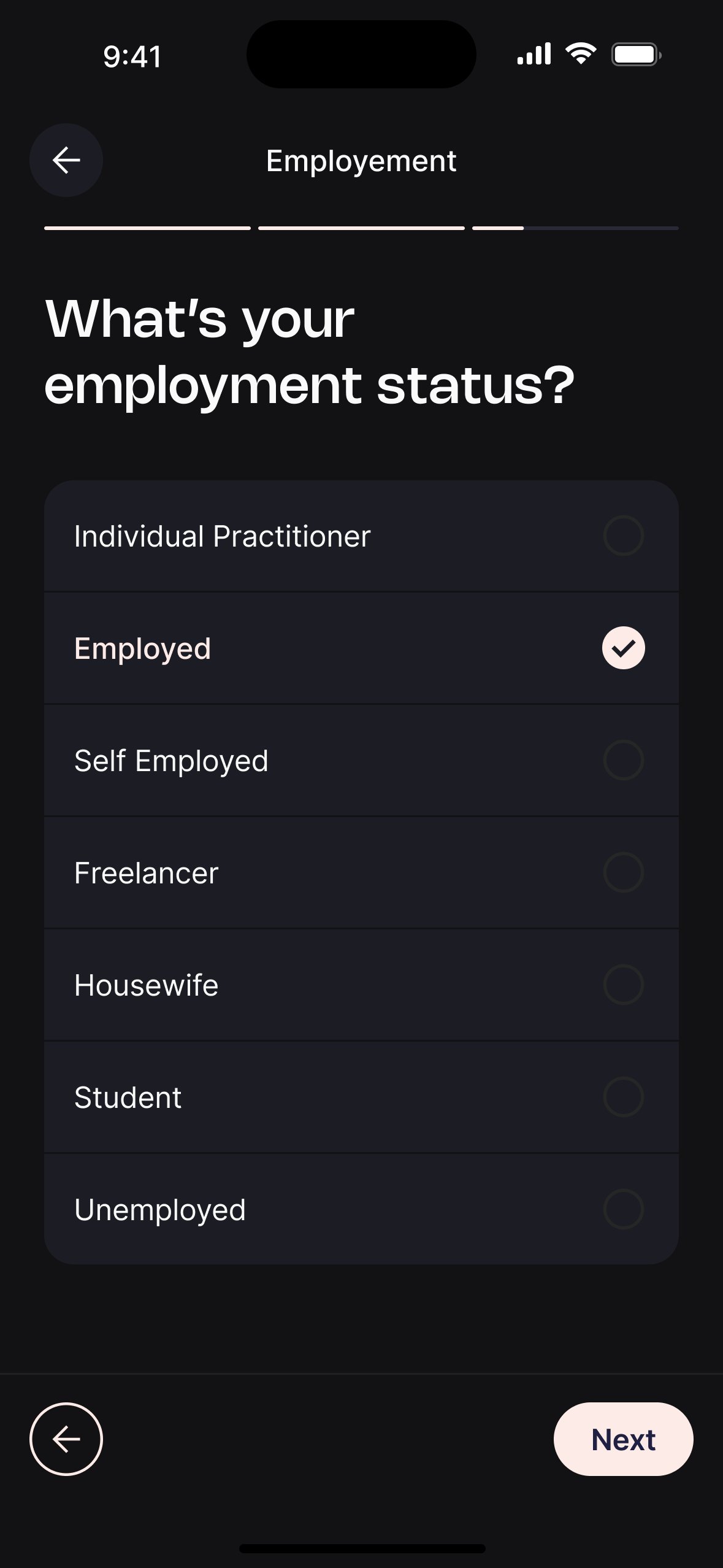
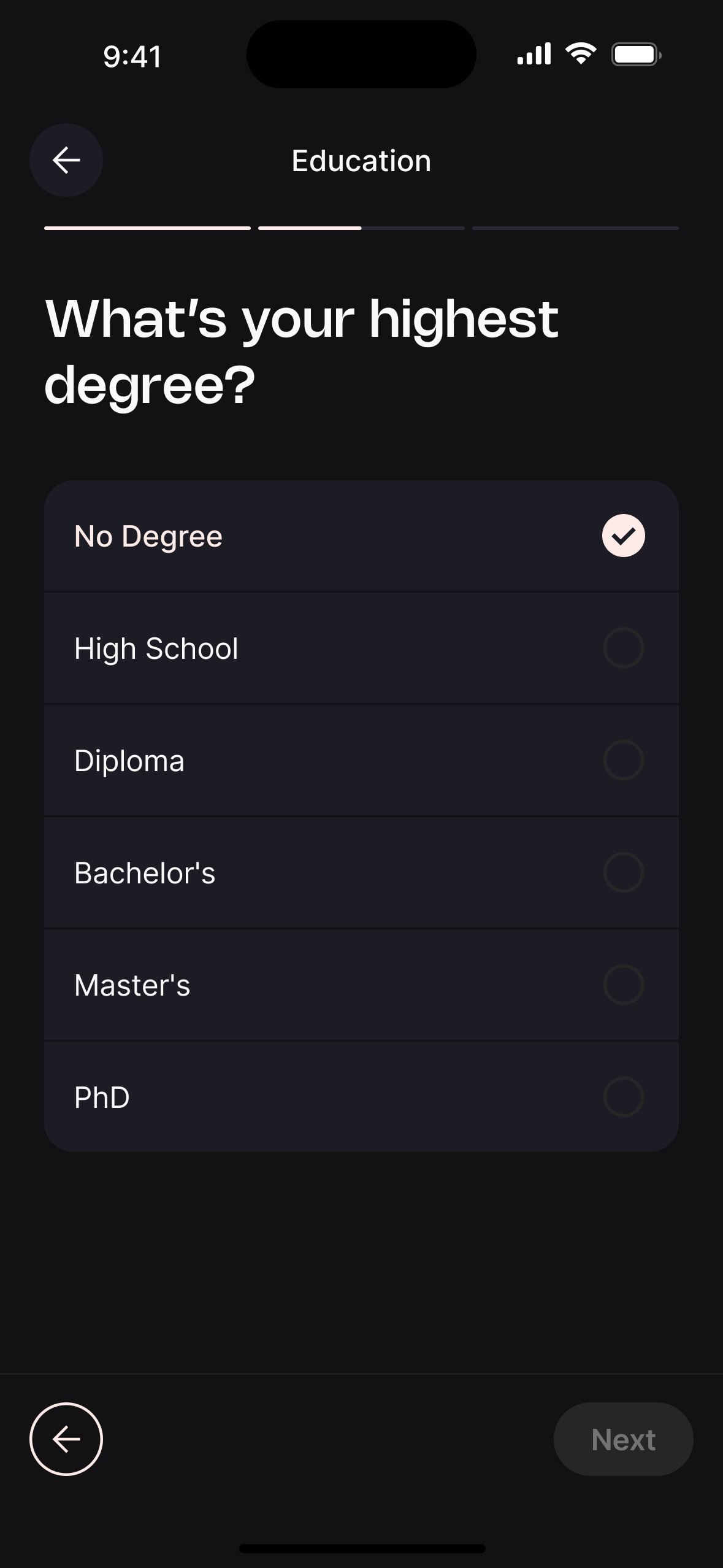
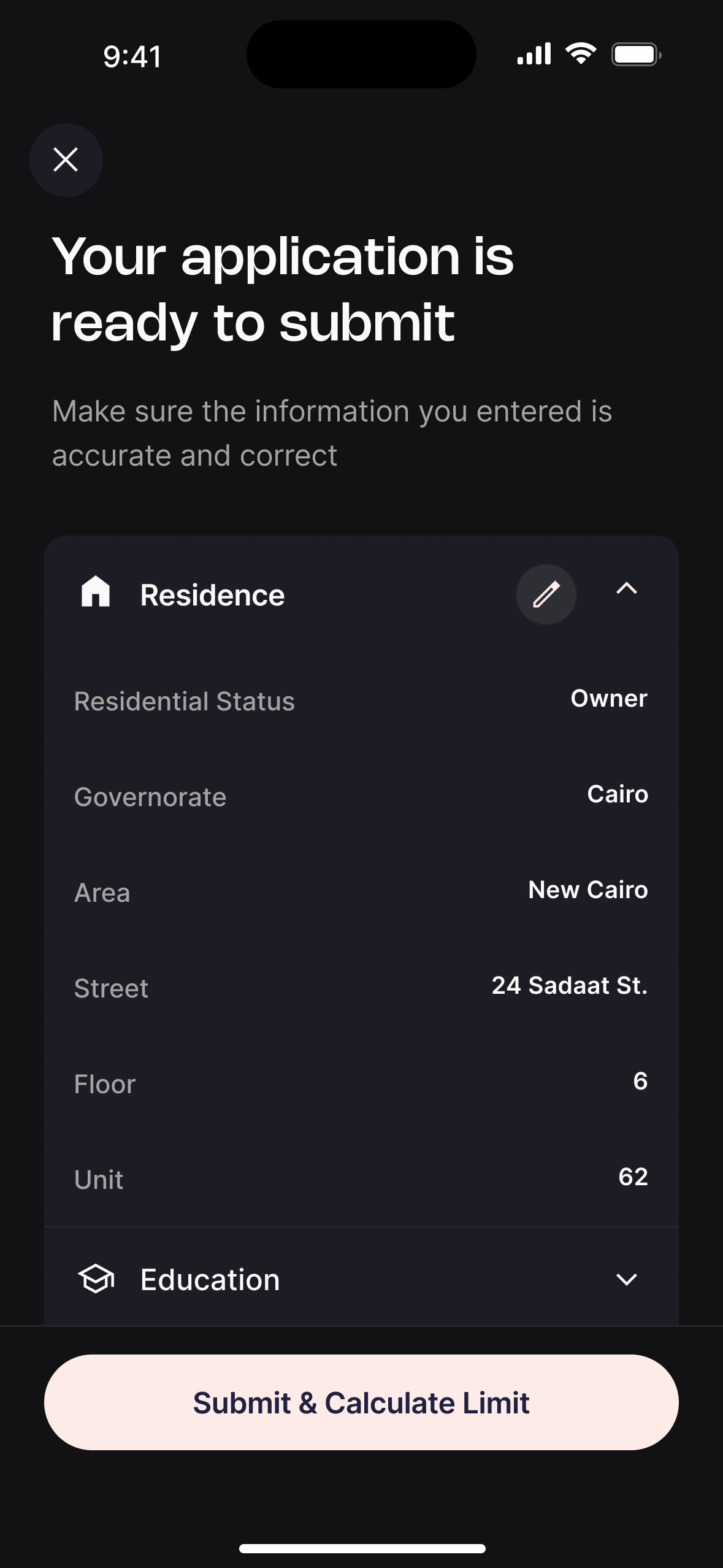
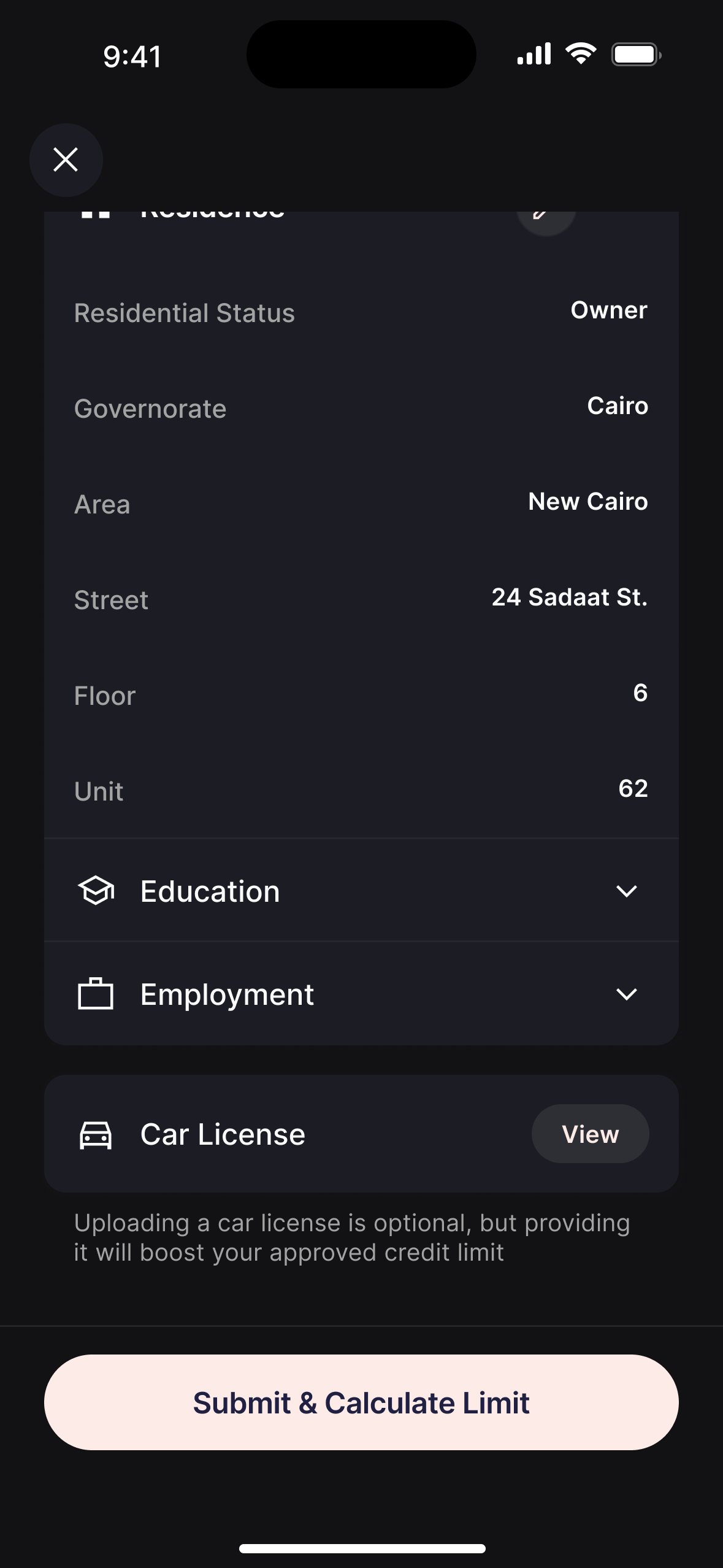

Eligibility check before the long form.
Originally the iScore and fraud check ran at the end. Users who would be rejected were filling in 8 screens of personal data before finding out.
Moved the check to immediately after OCR. Rejected users exit at step 2, not step 8 — reducing wasted effort and signalling respect for their time.
Semi-rejection as a product, not a dead end.
Binary approve/reject lost users in the grey zone, not eligible for the standard product, but not a hard rejection either.
Designed a semi-rejected state routing users to a specific program with modified terms. 22% of decisions are semi-rejections — all of them now have a path forward.
Loan Management.
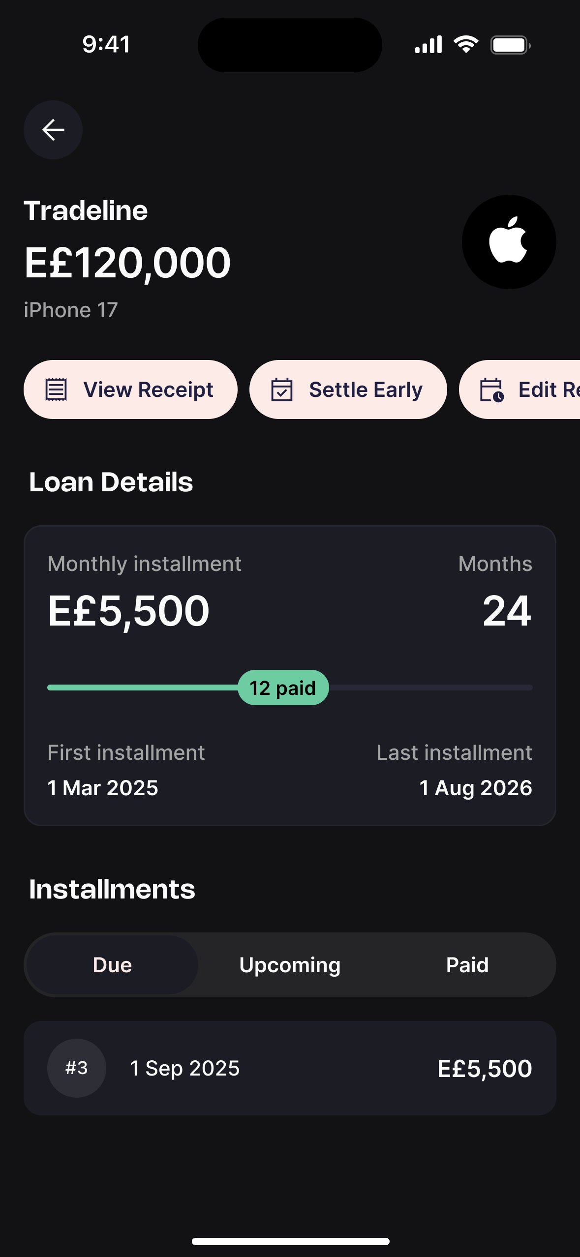
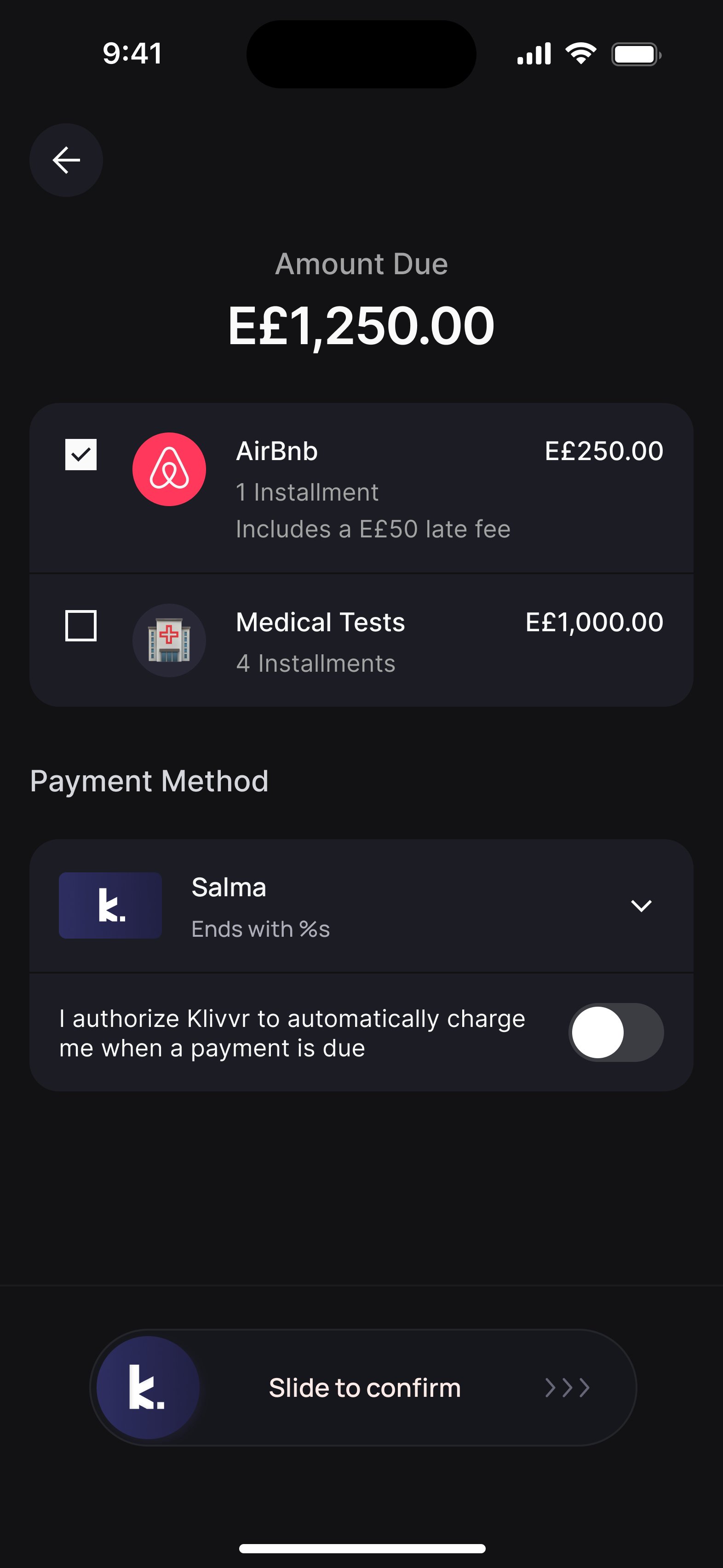
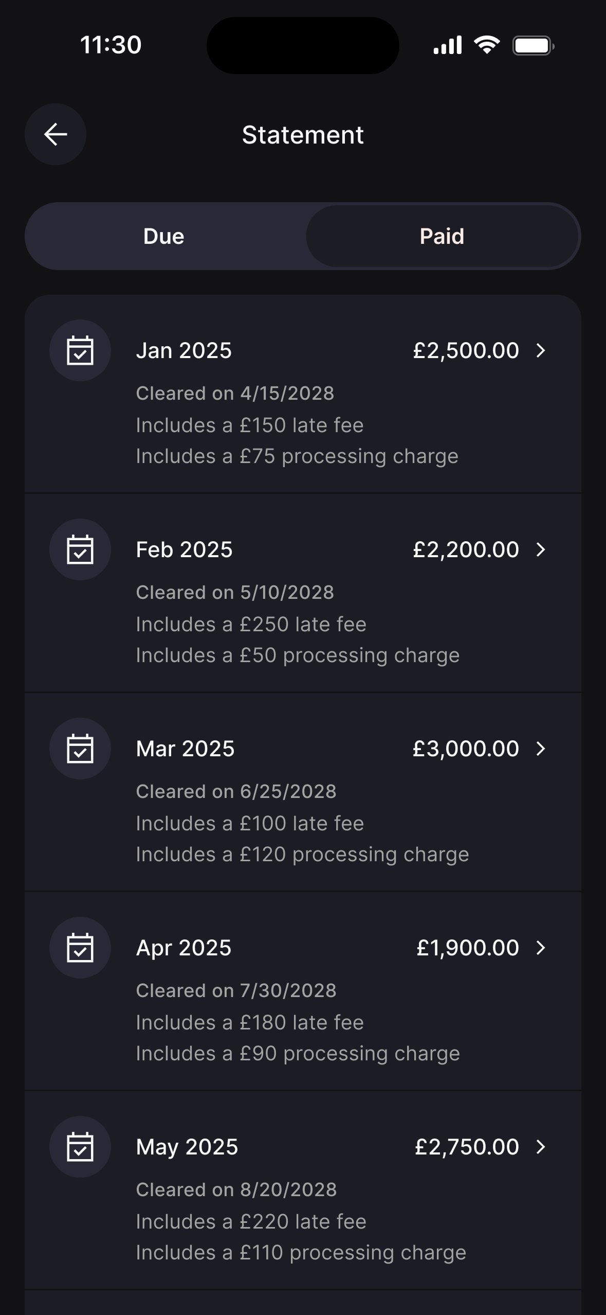
How approved users live with their credit day to day, managing multiple loans, tracking installments, paying on time, and settling early.
One hub, every journey.
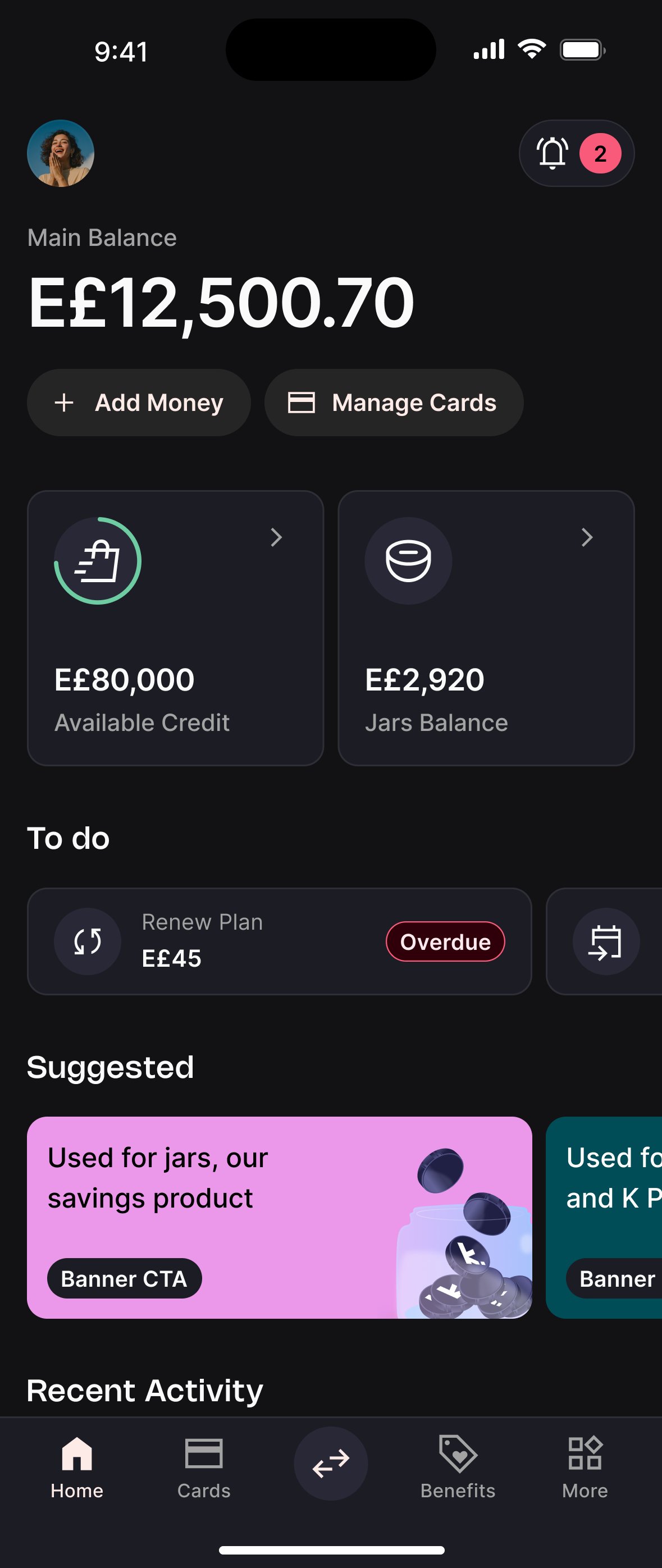
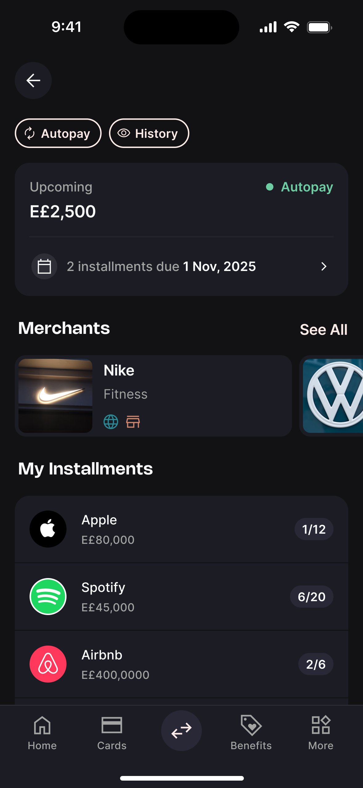
The LMS was designed around a single overview screen that gives users everything they need at a glance: available credit, upcoming dues, and all active loans, with clear paths into every action from there.
Due payments always above the fold.
The overview had to show available credit, due payments, and a full loans list. Without clear hierarchy, the most time-sensitive information risked getting buried.
Due payments became the primary element when loans are active. Every other navigation decision was subordinated to this — missing a payment was the most damaging thing that could happen.
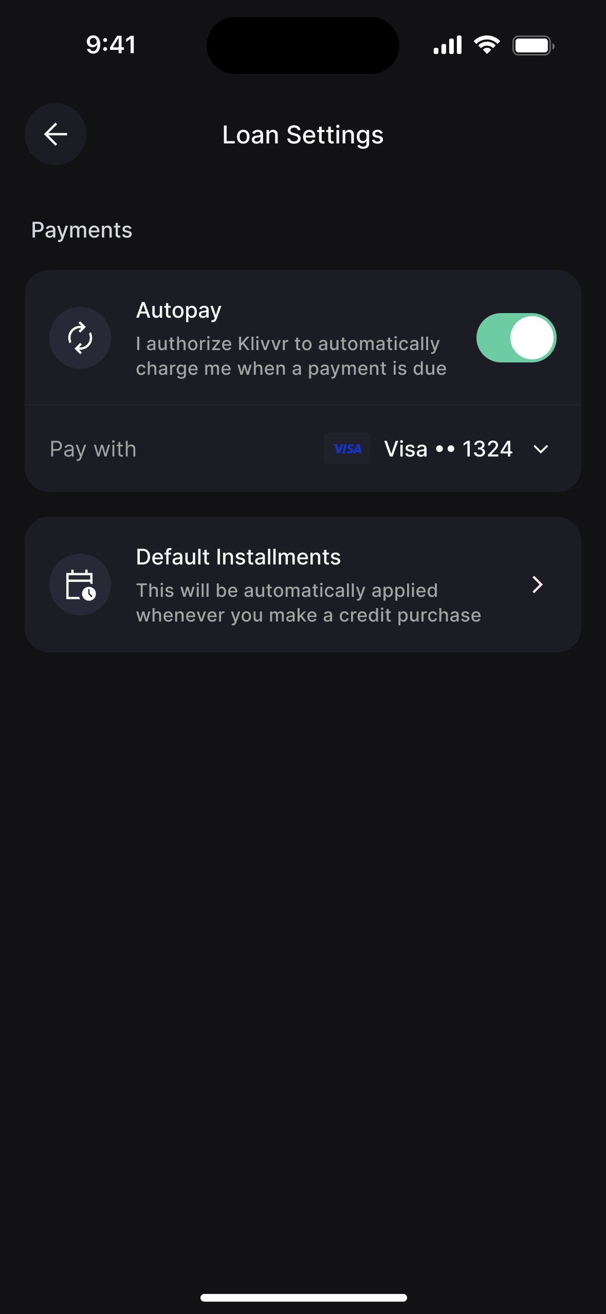
Autopay as a proactive insight, not a buried setting.
Autopay was only accessible through settings. Most users never found it — and a missed payment was the most damaging outcome for both the user and repayment metrics.
Added autopay as a quick insight card labelled "Avoid late payments," framed around user benefit. Result: 46% adoption, versus near-zero from settings alone.
On state design as the real work.
The happy path is easy. A lending product has more edge states than almost any other product type: no loans, one overdue loan, multiple loans in different stages, a closed limit. I spent more time on state design than screen design. That's what keeps the product coherent when real users arrive with real messiness.
On building without a benchmark.
No prior version, no existing pattern library for financial flows. Every decision left a trace — the patterns I built are now the baseline for every lending feature that ships after me.
On the 46% autopay number.
Moving autopay from settings to a proactive insight card was a small design decision with a disproportionate impact. It's a reminder that placement is content.